Pot | Financial Savings App
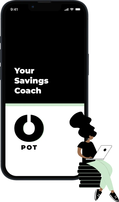
Your Savings Coach
A Simple App to Manage Your Savings and Finances
Context
Developed branding for a financial saving app, including logo and style guide, as part of my UI Design course at CareerFoundry, applying industry-standard methodologies and user-centered design principles. Created wireframes and mockups, ensuring consistency, mobile-first, and responsive design, with user testing to enhance usability
My role
UI Design, Branding, Logo Design
Problem
Many people struggle to track their savings and spending effectively, leading to financial stress and missed goals. Traditional budgeting tools can feel overwhelming or too complex.
Solution
Pot simplifies the process with an intuitive, friendly interface, clear insights, and smart saving tips, making financial management easy and approachable for everyone.
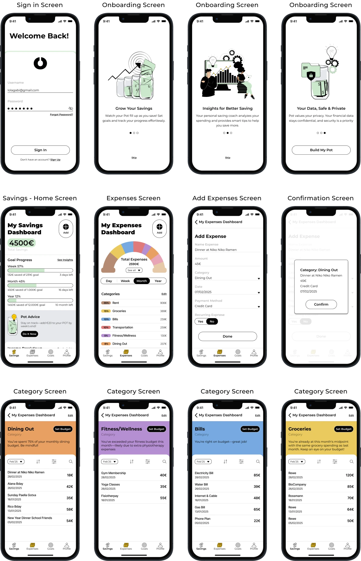
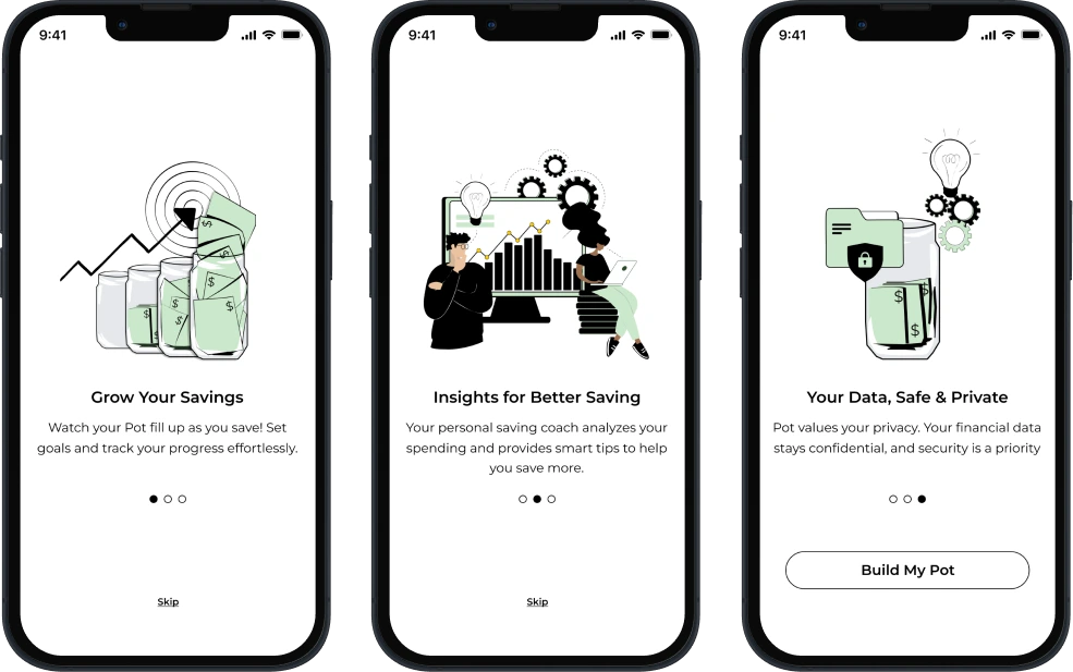
Onboardings
Friendly and Professional
The onboarding screens use simple, vibrant illustrations to create a friendly, engaging experience. The goal is that Pot feels like a personal finance coach in users' pockets, combining a welcoming approach with a professional, trustworthy design.
Tone and Voice
Clear, Warm, Empowering
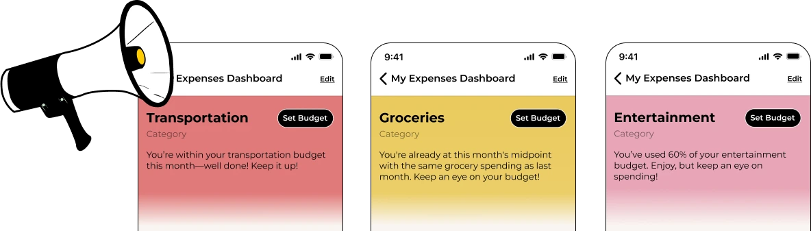
Financial apps often overwhelm with jargon and complexity. Pot's voice is approachable, reassuring and supportive, guiding users with straightforward advice and personalised insights.
Key Features
Intuitive and Engaging
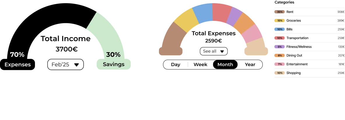
- Effortlessly track savings and spending
- Set budgets and categorise expenses
- Receive personalised insights and progress updates
- Get detailed breakdowns of income and expenses
Design Journey
From Wireframe to Final Design
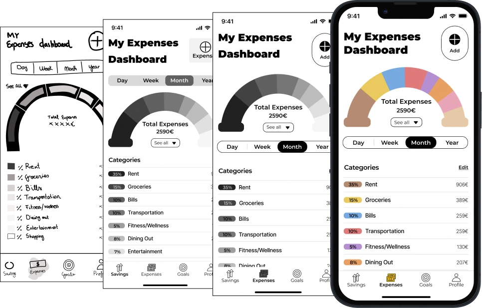
The design process began with low-fidelity wireframes focused on layout and scalability, evolving through mid-fidelity wireframes that refined content for clarity. User testing guided further refinements, enhancing usability and ensuring a seamless final design.
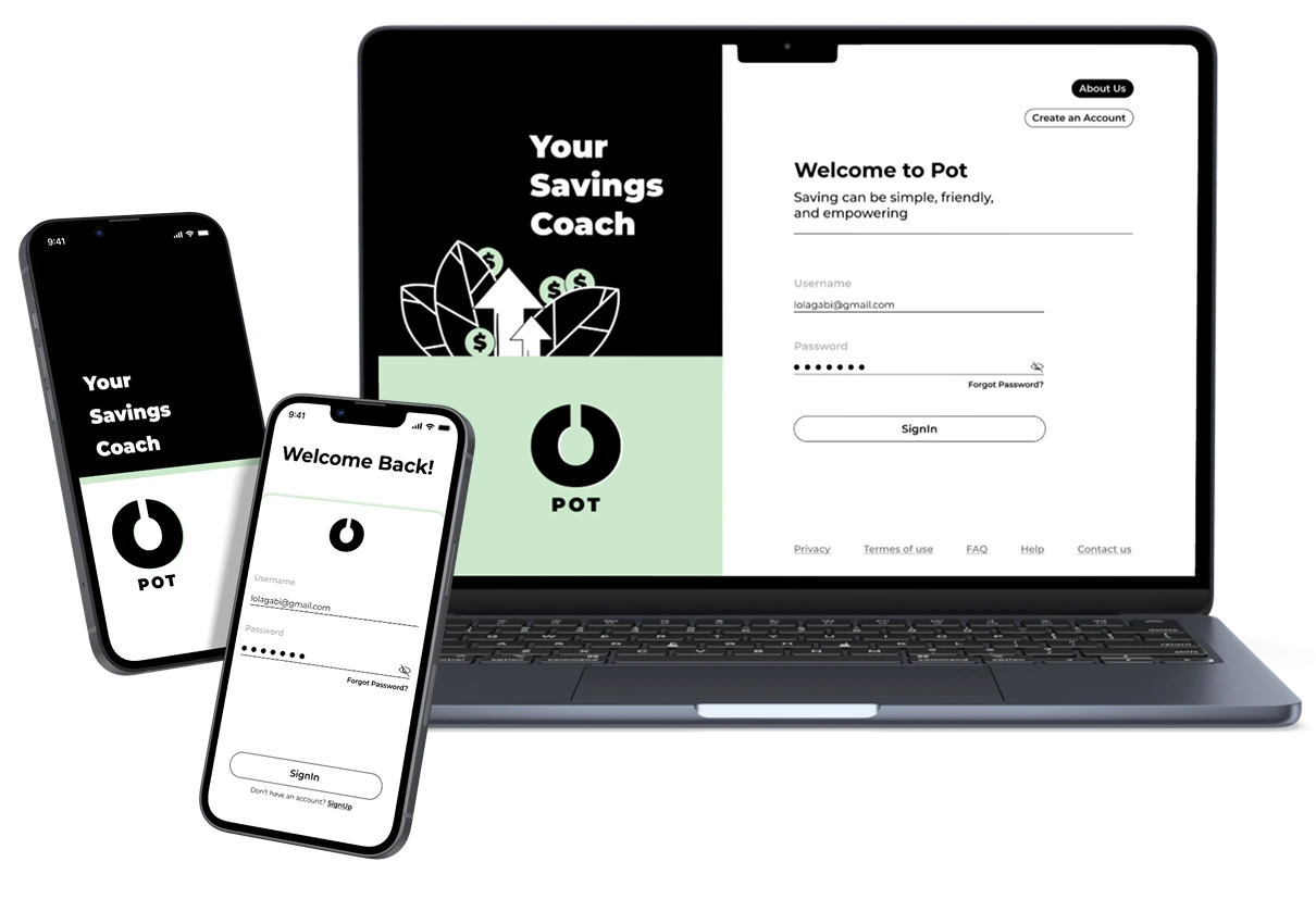
Final Screens
Mockups
The final screens reflect all the improvements made throughout the design process. A responsive layout was implemented, ensuring consistency across devices. The design seamlessly integrates colors, typography, tone, and layout, resulting in a cohesive and user-friendly experience.